
Reading time:
Where will the UX/UI design trends take us in 2021? How can we leverage them to make products useful to the users? To find out, we spoke with our lead designer, Evgeniya, who studied what is being said in the design communities. We are now ready to tell you about the methods that will help you get the best out of modern trends. Ready, set, go!
Dark theme
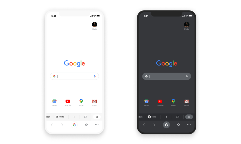
Of course, one of the main trends of 2020, the dark theme, will not lose its relevance in 2021. Following Apple and Android, other major market players, including Google, WhatsApp and Instagram, jumped on the dark theme train.
The dark theme is popular because it:
- looks impressive and stylish;
- allows you to highlight other design elements that are not visible in the regular version;
- saves battery consumption for OLED and AMOLED screens;
- reduces eye strain in low light conditions.
Most applications provide users with the ability to activate the dark theme at any time. Some offer automatic switching that can be configured in advance.
Minimalism and simplicity
As the American designer and programmer Alan Cooper once said: “No matter how cool your interface is, it would be better if there were less of it.”. In 2021, minimalism and simplicity are not going out of style and will continue to gain traction. This means we will see less clutter on websites and apps.
Minimalism may seem unoriginal, but there is no doubt that it is effective. This is especially true in the digital space when users are trying to complete a specific task.
The benefits of minimalism are that it’s:
- comfortable and pleasant to use, especially in contrast to the clutter that often occurs on the Internet in the form of intrusive banners and pop-ups
- reduces page weight and load times, which is especially good for mobile data users
- makes the design responsive and easily optimized for different platforms
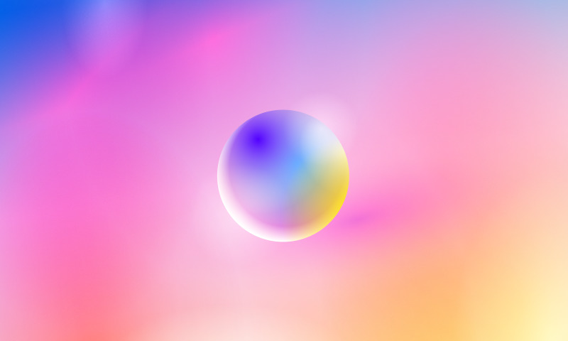
Shadows and gradients
Shadows and gradients were relevant before, but over time there has been a move towards more airiness, lightness and softness. These qualities compliment minimalism and do not overload the interface.
Instead of a linear gradient, use a mix of multiple colors and overlays. This makes the transitions between colors smoother. These gradients are called mesh gradients.
To achieve this effect, we recommend using more muted and pastel colors and shades for shadows and gradients.
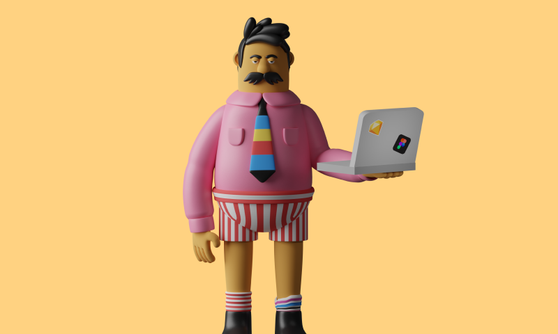
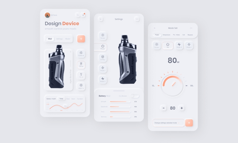
3D elements
3D design elements have been engaging users for several years. They grab attention, engage and encourage users to stay longer as shown by data demonstrating an increase in average session times.
In order to successfully embed 3D graphics on your website, you must create a high performance user interface. If your platform does not load quickly enough, it will not be able to display the 3D elements smoothly.
Neomorphism
Neomorphism is a relatively new design phenomenon that combines features of two directions:
- Skeuomorphism. This is a technique where the elements are outwardly similar to real things. Remember the iOS6 interface? Three-dimensional icons, the phone book looked like a notepad, YouTube looked like an old TV, and the calendar looked like a real wall-mounted version. This design direction has not completely disappeared, but it is rare.
- Flat design. Implies lack of depth and volume. Elements look like they were pressed into the work area. The main advantage of this is that digital products are made as simple and convenient as possible.
The former implies a realistic depiction of elements. Buttons, icons, switches, tabs, and other interface elements look like real objects. Neomorphism mimics reality and brings interfaces to life with physical elements with flat designs and soft shadows. Neomorphic interfaces are cleaner, futuristic and realistic.
When using this style, it is important to stay focused on the goal of ensuring the comfort of and convenience for the users. The interplay of light, shadows and volumes can lead to confusion about what is clickable and what is not. To avoid mistakes, the designer must follow the basic principles of creating elements and carefully think over their additional states.
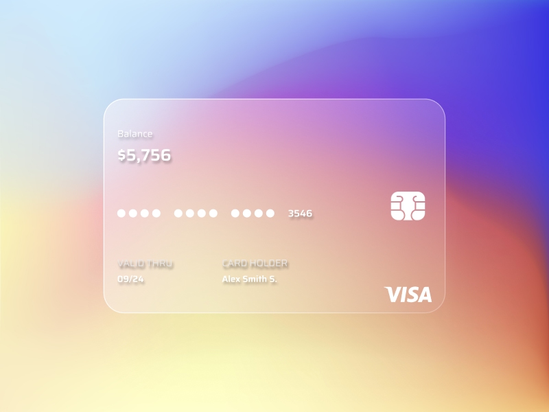
Glassmorphism
Glassmorphism is a new trend in interface design that is increasingly talked about in the design communities. But as you know, everything new is well forgotten old: this technique was first widely introduced in Windows Vista and iOS7. This style can now be seen in Mac OS Big Sur and Microsoft Fluent Design.
The characteristics of glassmorphism include:
- frosted glass effect with blur
- layering of objects
- bright colors that accentuate blurry transparency
- thin light border on semi-transparent objects
Glassmorphism is great for minimalist designs as the elements of the user interface lose gravity and become light. Proper use of the glass effect will help to avoid heavy elements in the interface and its clutter.
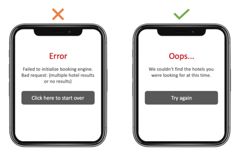
UX copywriting
As product creation is impossible without design, UX copywriting will become an integral part of UX / UI design in 2021. The trend that emerged at the intersection of design and copywriting and has been developing over the past couple of years is becoming a separate field.
UX copywriting aims to create a dialogue between the user and the site and help the user interact with the interface. This includes, but is not limited to, writing texts for buttons, menus, and error messages.
When you write succinctly, consistently, understandably and in a friendly way, you help the user to form a positive opinion of the product and increase the chances of getting the user to make a purchase. The main reason for this is that people have a clear understanding of what the product is capable of and how they can benefit from it.
AR design
Despite the fact that AR technologies were initially used mainly for entertainment (e.g., Snapchat masks and PokemonGo), their scope of application is expanding every year. Every industry from healthcare to education is now realizing the potential of AR to develop business solutions that were unthinkable a few years ago.
According to the Global Market Insights forecast, the global market for AR products will grow by 85% and reach the value of USD 165 billion. Investors are ready to invest in technology because they expect to profit considerably from it.
For example, Lamoda, Russia’s leading online fashion platform, has implemented a virtual sneaker fitting functionality. With this, it became easier for buyers to understand how the product would look in reality. As a result, conversion in this category increased by 8-9% and the time before purchase decreased by 10-15%.
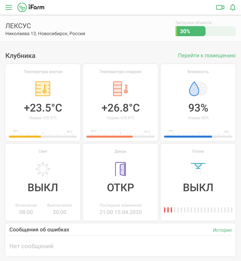
As part of the iFarm project (a system for the automatic management of vertical farms), we have created an interface design for AR glasses for farmworkers. Augmented reality allows the grower to see active tasks when looking at the shelf and mark completed tasks without switching attention to the web application.
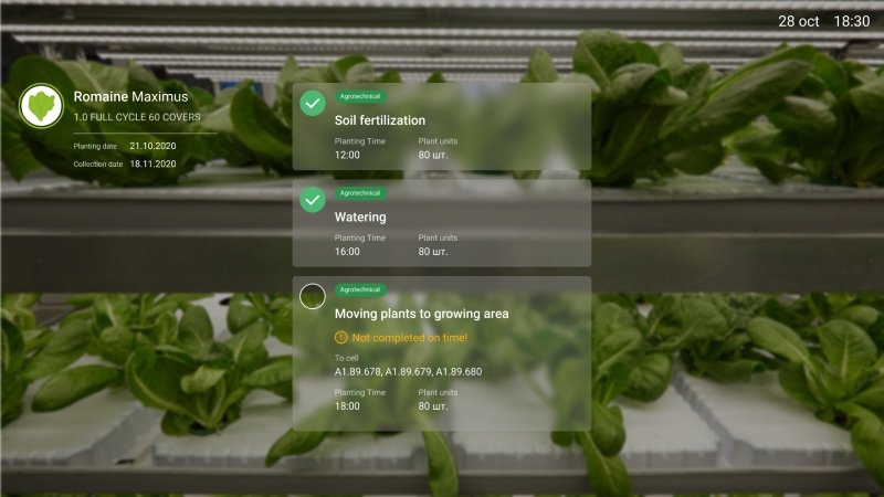
Farmworkers receive over 200 plant care tasks every day in a 1000+ shelf facility. With the new interface, they perform the tasks more efficiently.
You have now been acquainted with the main long-term UX/UI design trends according to Azoft. We hope that these trends will inspire you to strive for bold, new design solutions! Keep in mind the main goal of UX/UI design is to help users solve their problems. If you wish to enhance your project with new design solutions, we are ready to help you!

Comments