Making a Paper Folding Animation in Android

IT copywriter
Reading time:
Inspired by Facebook Paper for iOS, in one of our recent projects we decided to implement a similar paper folding animation when opening elements from a list. Initially, we tried to use an existing implementation — the android-flip library that uses OpenGL for rendering animation — but it ended up displaying rather noticeable screen artifacts (image flickering) in the latest version of Android. Plus, the library needed considerable modification as it was designed for flipping elements in a list, while our project required animation when opening elements from a list. You can see the difference in the demo video below: Foldable list is what android-flip can do, Unfoldable details are what we actually needed.
Considering this scenario, we decided to implement the effect ourselves and, since the minimum supported Android version for the app was 4.0, we used standard Android SDK methods instead of OpenGL: View.setRotationX(), View.setScaleX(), etc. When hardware acceleration is enabled (and it is enabled by default if your target API level is >=14), these methods work quite efficiently using the device GPU.
The results came out looking very nice, so we decided to share our approach. While this article covers the basic implementation points, all of the actual code can be downloaded from GitHub: FoldableLayout.
Paper Folding Animation: Layout
The first element to design was a layout that can fold in half. Our approach was rather bold: the main layout (FoldableItemLayout) simply contains a specialized layout (BaseLayout). During the animation, the BaseLayout writes its contents to cache which is a specially created Bitmap object based on the size of the original layout.
class FoldableItemLayout extends FrameLayout {
 @Override
 protected void onSizeChanged(int w, int h, int oldw, int oldh) {
 Bitmap cacheBitmap = Bitmap.createBitmap(w, h, Bitmap.Config.ARGB_8888);
 mBaseLayout.setCacheCanvas(new Canvas(cacheBitmap));
 }
}

class BaseLayout extends FrameLayout {
 private Canvas mCacheCanvas;

 private void setCacheCanvas(Canvas cacheCanvas) {
 mCacheCanvas = cacheCanvas;
 }

 @Override
 public void draw(Canvas canvas) {
 mCacheCanvas.drawColor(0, PorterDuff.Mode.CLEAR);
 super.draw(mCacheCanvas);
 }
}
In addition, we needed to use two extra Views (PartView) — for the upper and lower image halves — which would display the corresponding data in cache that represents the upper and lower halves of the image (Bitmap). Both Views encompass the entire area of the main layout, but display only the required parts. To achieve this effect, we calculated the Bitmap limits — and in the onDraw() method we made Canvas draw the required part via the drawBitmap (Bitmap bitmap, Rect src, RectF dst, Paint paint) method.
Then we managed to rotate these extra Views by setting the setRotationX() method to the corresponding angle, achieving independent rotation of the lower and upper parts of the images. To pull this off, we add a new parameter for the FoldableItemLayout – with the name FoldRotation.
The FoldRotation parameter values in diapason (-180, 180]:
- FoldRotation = 0 – Both parts have zero rotation. In this case we can skip the Bitmapcache and display the original layout in real time.
- 0 < FoldRotation < 90 – The lower part rotates to the FoldRotation angle; upper part has zero rotation.
- -90 < FoldRotation < 0 – Only the upper part rotates.
- 90 ≤ FoldRotation < 180 – The lower part is no longer seen. In this case the FoldableItemLayout containing the next layout should appear over the current FoldableItemLayout.
- -180 < FoldRotation ≤ -90 – the upper part is no longer seen. In this case the FoldableItemLayout containing a previous layout should appear over the current FoldableItemLayout.
- FoldRotation = 180 – Both parts are hidden.
Now having a secondary layout that allowed us to “fold” the elements it contained, we were then able to make a FoldableListLayout – a ListView-like layout that creates list elements and wraps them into FoldableItemLayout by using BaseAdapter. Again, we used the FoldRotation parameter, but in this case it determined the elements position in a list.
For example, at FoldRotation = 30 the first element (FoldableItemLayout) in the list has the FoldRotation value of 30, and the second – FoldRotation = 150. No more than two elements will be displayed simultaneously. The FoldRotation parameter value range depends on the number of elements: if the list contains one element, it would be [0, 0], two – [0, 180], three v [0, 360], etc.
Paper Folding Animation: Opening
After having learned to scroll between several elements with folding animation, we then tackled the major challenge: generating an opening animation of elements from any starting point. We did it using the already implemented FoldableListLayout and made it switch between two elements: cover layout and details layout. Both elements should be on a screen, but the details element should be hidden. When a user clicks on a cover element, the app remembers its current position, replaces it with an empty placeholder View of the same size (so as not to disrupt other elements on the screen), and moves the cover element to the lower half of the specially created layout. Later this layout would be used as the first element of the FoldableListLayout, while the second element would be the details element that was replaced by an empty placeholder View the same way as the cover element.
Paper Folding Animation in Android: Adjustments
Seeing that the cover element had to unfold from its initial on-screen position, our FoldableListLayout , therefore, needed to move between the cover element and details element positions during the animation. That’s why it’s vital to remember the initial position and size of each element during the animation’s initialization. Since the cover and details can differ in size, we needed to scale them simultaneously during animation so the widths of both elements coincided.
We are almost there; just one more thing: After scaling, the cover height may appear smaller than the details lower half, which means you will need to hide the remaining part of the image.
The screenshot below shows a gray area appearing at the beginning of the animation and the lower part of the details that don’t fit the cover size.
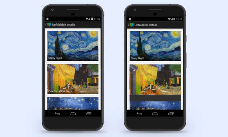
Introducing an extra parameter for FoldableItemLayoutm – let’s name it RollingDistance– solved the issue. This parameter was responsible for shifting the image vertically from the fold line. Using this parameter, it’s possible to shift a part of the details imperceptibly during the first part of the animation and then unfold it full-size in the second part.
The animation is now ready to run, and all that’s left is to add some darkening for a realistic effect, or flecks for a glossy look. Feel free to use the library on GitHub, where you can also find a usage example. Pull requests are welcome as always.


Comments